Cascading Style Sheets… Like a waterfall (from the most general to specific)
Types
Inline
<html style="background:blue">
	<head>
	...
	</head>
</html>- CSS goes in to the opening tag of HTML elements (used commonly for testing)
- Used for specific, single element
styleis a global attribute
Internal
<html>
	<head>
		<style>
			html {
				background:red
			}
		</style>
	</head>
</html>- Used for single web page
- Goes under
<head></head>(a convention) htmlis our selector, it can be any other tag like<h2>
External
/*Index.html*/
<html>
	<head>
		<link
			rel="stylesheet"
			href="./styles.css"
		/>
	</head>
</html>

/*style.css*/
html {
	background:green
}- Used for multi-page websites, mainly used
rel="stylesheet"- what is the relationship of the thing we’re linking?
href="./styles.css"- where is it located?
- Syntax:
property:value(ex.background:green)
Selectors
Helps us choose where to apply our CSS
- The part that selects the HTML to apply whichever CSS styling you want
- Class selector
- Used to group together HTML elements to apply the same CSS
<h1 class="title"> TITLE </h1>
- ID selector
- Class → applied to MANY elements
- ID → applied to a SINGLE element in a single HTML file (UNIQUE)
- Attribute selector
- HTML element, then the attribute you want to select within the element
p[draggable]→ all paragraph elements with the attribute draggable
/*Element selector*/
p {
	color:blue
}

/*Class selector, meant for versatility and many elements*/
.red-text {
	color:red
}

/*ID selector, meant to be specific and used once in a single HTML file*/
#main{
	color:green
}

/*Attribute selectors*/
/*All paragraph elements with the draggable attribute*/
p[draggable]{
	color:red
}
/*Another way... only selecting ps with draggable=TRUE */
p[draggable=True]{
	color:red
}

/*Universal selector*/
*{
	color: red
}
Properties
Color
h1{
	background-color:red;
	color: #5D3891
}- List of colors (docs): https://developer.mozilla.org/en-US/docs/Web/CSS/named-color
- Color palettes: https://colorhunt.co/
- You can use hex codes instead of the name
Font
h1 {
	font-size: 20px;
	font-weight:bold;
	font-family: Helvetica, sans-serif;
	text-align: center
}font-size- 1px: (pixel) inch, or 0.26 mm width and height
- 1pt: (point) inch, or 0.35 mm
- 1em: 100% of parent
- Can get confusing real quick
- 1rem: 100% of root
- The root is usually the
htmlelement that encloses everything inside - more recommended to use
- The root is usually the
- named font size (ex.
font-size: xx-large;)
font-weight- keywords: normal, bold
- relative to parent: lighter, bolder
- number: 100 - 900 (light - bold)
font-family- 1st choice, backup choice (generic typeface)
font-family: Helvetica, sans-serif;- Use quotes for names w/ spaces: “Times New Roman”
- https://fonts.google.com/
- 1st choice, backup choice (generic typeface)
text-align- center
- left, right
- start, end
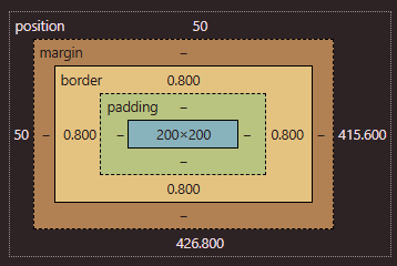
The Box Model
Margin, Padding, Border (and width and height)
- Each element is a BOX
- Website to experiment: https://appbrewery.github.io/box-model/
h1 {
	width:100px;
	height:100px;

	/* having no border ONLY on the top */
	border:10px solid black;
	border-top:0px;
}
h2 {
	border:10px solid black;

	/*top, right, bottom, left (clockwise) */
	border-width:0px 10px 20px 30px;

	/*x-values (top,bottom) and y-values (L&R) */
	border-width: 5px 5px;

	padding: 20px
}- Border
- goes outwards and not inwards → Height/width of the element itself does not change
- padding
- PUSHES THE BORDER OUT from the element!!
- adds space between the element and the border
- commonly used with text
- margin
- outside the border
border-width, padding, margin- 4 values → all sides clockwise
- 2 values → top/bottom and left/right
- 1 value → for all sides
- ex)
border-width: 4px 5px
Chrome dev tools
- Can edit stuff to experiment
...→ More tools → CSS overview → Capture Overview- Lots of Useful features
- You can see which font/color/etc the website uses
The Cascade
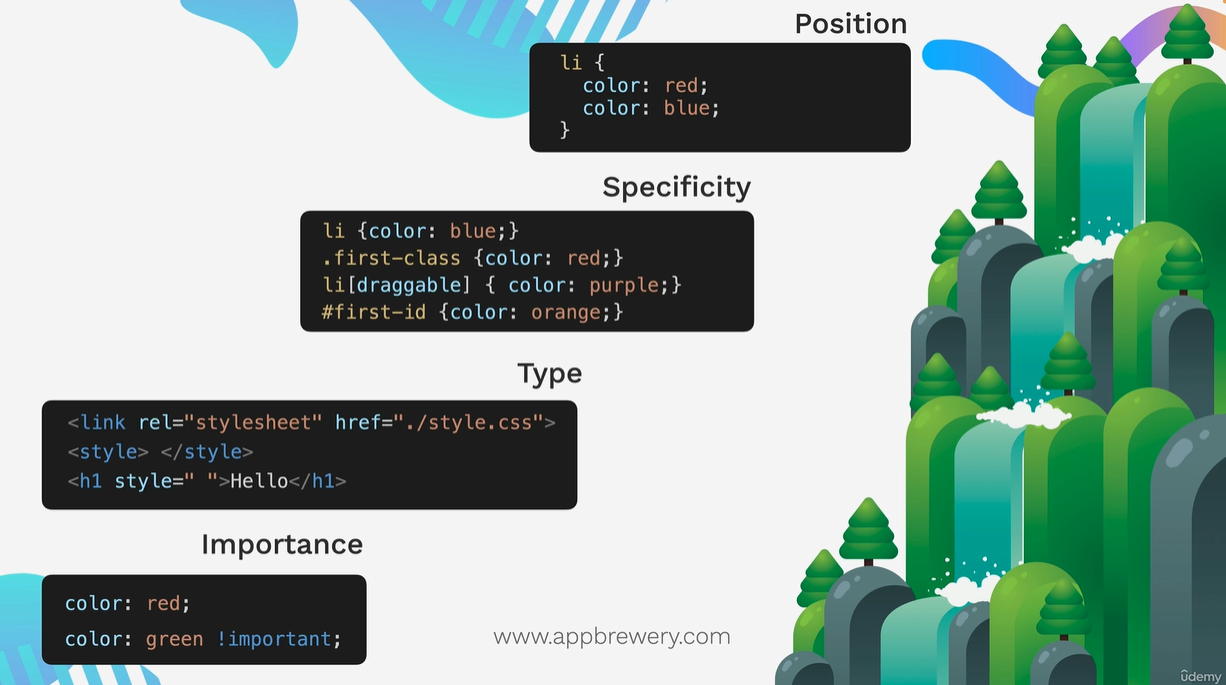
- external style sheet → internal → inline
- CSS is applied in this order
- 4 categories we look at when we’re determining the overall lvl of importance of a CSS rule
- Position > specificity > type > inheritance
Position
li {
	color: blue;
	color: red;
}- red will be applied at the final
- the lower down in a CSS external file or in an internal style element
Specificity
<li id="first-id" class="first-class" draggable>

/* (style.css) the lower, the more specific */
li {color:blue;} /* element */
.first-class {color:red} /* class */
li[draggable] {color: purple;} /* attribute*/
#first-id {color: orange;} /* id */- we would see orange
Type
<link rel="stylesheet" href="./style.css">
<style></style>
<h1 style=""></h1>- External
- Internal
- Inline
Importance
Importantkeyword
color: red;
color: green !important;
Examples
<head>
	<style> #an-id { color:green } </style>
</head>
<body>
	<h1 id="an-id" style="color:blue;"> Hello </h1>
</body>- Even though id has the highest specificity, the type comes first in the CSS cascade (which indicates inline css has higher priority than internal)
- so we would see blue
Combining Selectors
Group Rule
- Apply to ALL selectors
- using a comma
selector, selector {
	color: blue;
}
Child Rule
- DIRECT child of 1st selector, the ancestor (only 1 level deep)
selector > selector {
	color: blue;
}
Descendant
- Apply to a descendent of left side (as MANY LEVELS)
- it selects every descendant
selector selector {
	color: blue;
}
Chaining
- SUPER SUPER SPECIFIC →Apply where ALL selectors are true
- make sure element goes first
- everything should be at the SAME LEVEL
selectorselector {
	color:blue;
}<h1 id="title" class="big heading"> Hello World </h1>h1#title.big.heading{
color: blue
}- chained all selectors together to apply to a single element
COMBINING COMBINERS
selector selectorselector {
	color: blue;
}
CSS Position
Relative, absolute, fixed, static positioning
- position is actually outside of margin
- https://appbrewery.github.io/css-positioning/
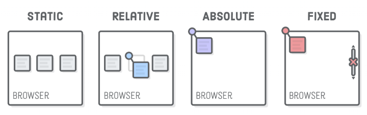
Static
- The HTML default
- just goes to the bottom of whatever previous element there us
- you can add left/right/top/bottom values but it won’t really do anything
Relative
- relative to its DEFAULT position.. you can move it relative to where it should be!
Absolute
- top left corner of nearest positioned ancestor OR top left corner of webpage
- A positioned ancestor
- any ancestor element (parent, grandparent, etc) that has a
positionvalue other thanstatic relativemost commonly used
- any ancestor element (parent, grandparent, etc) that has a
<div class="parent">
  <div class="nested"></div>
</div>
.parent {
position: relative; /* it's a positioned ancestor */
background: blue;
}
.nested { /* will be positioned relative to parent's top left corner */
position: absolute;
background: coral;
}Fixed
- relative to the top left corner of the browser
- defaulted to the browser!
Example of child elements relative to their parent
- If you want to position child elements relative to their parent, you should set:
Parent: position: relative;Children: position: absolute;
- When a child has
position: absolute;, it looks for the nearest positioned ancestor (an element with relative, absolute, or fixed positioning). - If the parent has
position: relative;, the children will be positioned inside the parent instead of the whole page.
Z-Index
- determines which elements goes on top of which in the z-axis
- everything on screen has default of
z-index: 0- but when you set something in absolute position, it actually puts it in ANOTHER LAYER
- when absolute, you can set the index to -1 or 1 to make it behind/above the main layer but it cannot go in the main layer where everything is 0
Some thoughts
- Parent -
relative, Children -absoluteis a common structure - If a child takes up the same width/height as the parent, use 100% instead of copying px values
- CSS
positioncomes withtop,bottom,left, andrightand these only work whenpositionis notstatic - Most browsers apply default margins to
<p>, <h1>, <h2>, etc.- If you see unexpected gaps in your layout, check the default margins of text elements and remove it.
- margin collapsing
inline-blockhas no margin collapsing (so the margins DO NOT overlap)
CSS Display
h1 {
	display: inline
}block- the default
- entire full width block!! the next element will go below (not the same line)
inline- allows to flow together
- will go in the same line until we can no longer fit anymore into the width of the webpage (which then it would go to the next line)
- CAN’T set the size (height and width) of the inline elements coz they will automatically default to the size of their content
inline-block- inline element allows us for elements to go to the same line
- block element allows us to set height and width
none- makes any element disappear
- sometimes useful when you need to hide an element or check an item
CSS Float
float: left;float: right;- without float, it will usually take the entire block, but with float the text will flow naturally
- if you want an element (something like footer) to not be affected
clear: leftclear: both
- Just use float to have text wrap around stuff, NOT FOR LAYOUT
CSS Flexbox
Use this for overall page structure!
- helps to align things along a 1D line
wtf is flex
- set on the css display property, even though it’s a completely different thing!
- put it in the container that contains all the elements
flex- Usually different element will have different display values (div will be full block, span will be inline, etc)
- when you enclose all elements inside a flex container, all previous display values will be ignored
- the width of each elements will be based on the content size (flex will try to duisplay all content in one line)
- The flex is like a block container (has 100% width)
inline-flex- basically flex, but other things can go occupy that same line
- DOES NOT occupy the entire block
- occupies as much as the content
- container behave like an inline element (like
span), meaning its width depends on its content- flex-basis doesn’t work
.container {
	display: flex;
	gap: 10px;
}
Flex Direction
How next item is stacked on the page
- The main axis is the direction in which items are laid out.
- The cross axis is always perpendicular to the main axis.
.container {
	display: flex;
	flex-direction: row;
	gap: 10px;
}-
flex-direction: row- set by default
- sets main axis to horizontal and sets cross axis to vertical
-
flex-direction: row-reverse;- Same as
row, but items go right to left
- Same as
-
flex-direction: column- sets main axis to vertical and sets cross axis to horizontal
-
flex-direction: column-reverse;- Same as
column, but items go bottom to top
- Same as
-
flex-flow- shorthand for the
flex-directionandflex-wrap - default is
row nowrap flex-flow: column wrap;
- shorthand for the
-
flex-basis: 100px
- sets the initial main size of a flex item
- if main axis is horizontal, it changes the width
- if main axis is vertical, it changes the height
- set on the CHILD of the flex container
- sets the initial main size of a flex item
Flex Layout
A very useful website: https://appbrewery.github.io/flex-layout/ Another awesome website: https://css-tricks.com/snippets/css/a-guide-to-flexbox/ simple game: https://appbrewery.github.io/flexboxfroggy/
flex-wrap- Set to the parent container
flex-wrap: nowrap- set to default
- things just get pushed beyond the page
align-items→ worksalign-content→ does nothing because there’s only one row/column
flex-wrap: wrap- useful when you run out of space in the horizontal
- moves elements that doesn’t have enough space to fit to the next
align-items→ aligns items inside each row/columnalign-content→ spaces between the rows/columns
justify-content- Set to the parent container
- Sets the distribution along our items along the main axis
flex-startflex-endcenterspace-betweenspace-aroundspace-evenly
align-items- Set to the parent container
- Sets the distribution along our items along the cross axis →
justify-contentversion for the cross-axis - only when
flex-wrap: nowrap; flex-startflex-endcenterbaselinestretch→ stretches everything from top to bottom, filling the container
align-self- individual itemsalign-content- Similar to
align-itemsbut only works when you haveflex-wrap:wrap - If there’s only one row →
align-itemscontrols positioning. - If there are multiple rows (
flex-wrap: wrap;) →align-contentcontrols row spacing, andalign-itemsonly affects the items inside each row.
- Similar to
Flex Sizing
content width < width < flex-basis < min-width/max-width
- This is the priority list (R to L) of how flex decides the *size of the elements
- content width
- by default elements set to content width
- by default (if no width/flex-basis/min-width/max-width is set), max width is set to the entire string length, min width is set to the longest word in the string
- If you have bunch of p tags in a flex container, when you shrink the container, then the p tag (default maximum width = content width, which is the length of the string) shrinks until it’s the minimum width (text wraps until longest word)
- width
width: 100px- will try to respect that width until there is not enough overall width of the container (then it will just use the same algo as content width to shrink)
- flex-basis
flex-basis: 200px- will try to respect that flex-basis until there is not enough overall width of the container (then it will just use the same algo as content width to shrink)
- min-width/max-width
- max-width
- how big each item can grow to
- will respect flex-basis (meaning max-width will be ignored) UNLESS max-width happens to be smaller
- min-width
- how small each item can shrink to
- will respect flex-basis (meaning min-width will be ignored) UNLESS min-width happens to be bigger
- max-width
flex-grow/flex-shrink and flex-basis
flex-growandflex-shrinkact like relative speed controls for how much an element grows or shrinks compared to its siblings
.item {
	flex-basis: 100px;
	flex-grow: 0;
	flex-shrink: 0;
}- means that flex cannot grow or shrink
.item {
	flex-basis: 100px;
	flex-grow: 1;
	flex-shrink: 0;
}- means that flex cannot shrink
- the minimum is 100px (flex-basis), but as you grow the screen it will occupy the entire width
.item {
	flex-basis: 100px;
	flex-grow: 1;
	flex-shrink: 1;
}- flex basis will be completely ignored
flex-basis
.item {
	flex-basis: 0;
	flex-grow: 1;
	flex-shrink: 1;
}- the default for flex-basis is auto
- looks at amount of content for each item, gives more flex basis to the items with more content
- if you want everything to be equal width (when flex-growth > 0),
flex-basis:0- Since they all start at 0 (
flex-basis:0), they grow equally based on available space (flex-growth:1).
- Since they all start at 0 (
.item{
	flex: 1 1 0; /*grow shrink basis*/
	flex: 1 /* SAME WITH ABOVE!! */
}- shorthand!!
- flex:1 → grow: 1, shrink 1
- flex:2 → grow: 2, shrink 2
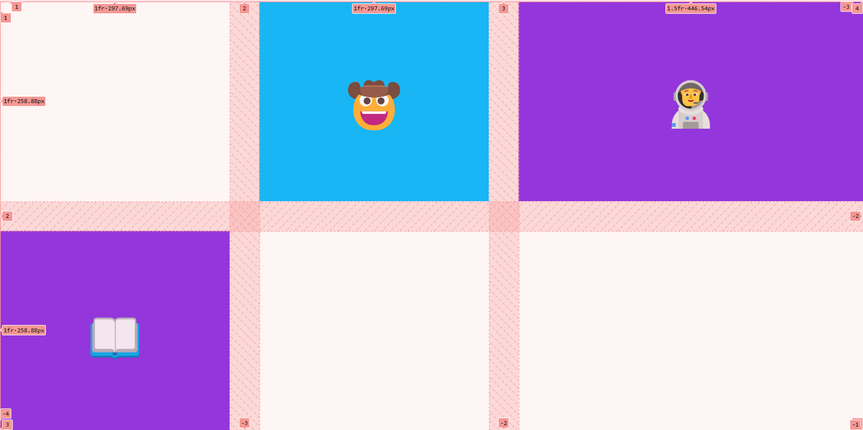
CSS Grid
Useful for laying content in a 2D grid
- Usually used together with flexbox
- https://appbrewery.github.io/grid-vs-flexbox/
- https://appbrewery.github.io/gridgarden/
- when you shrink, everything lines up with each other on a column and row basis
- Tracks
- We have row tracks and column tracks, which we usually size them using
grid-template-columnsandgrid-template-rows
- We have row tracks and column tracks, which we usually size them using
- Cell
- The intersection of the units (each box)
- smallest unit in a grid, are different sizes
- you can use multiple cells to create a grid item!!
- Grid lines
- horizontal + vertical lines
- can control these using the gap property to specify its height or width
- When we write code, it places all these elements (the grid lines, the tracks, the cells), then grid fills in the grid from the start
Grid Sizing
.container {
	display: grid;
	grid-template-columns: 1fr 2fr; /* using ratio */
	grid-template-columns: 200px 200px; /* using absolute values*/
	grid-template-rows: 1fr 1fr;
	gap:10;
}- CSS Grid assumes the number of rows and columns based on
grid-template-columnsandgrid-template-rows. - fixed values aren’t responsive
Using auto
.container {
	display: grid;
	grid-template-rows: 100px auto;
	grid-template-columns: 400px auto;
}grid-template-rows- 1st row will have height of 100px, and auto will just try to fit the content for the 2nd row based on its size
gtid-template-columns- 1st column will have width of 400px, 2nd column will fit the rest of screen
Using fractions
.container {
	display: grid;
	grid-template-rows: 1fr 2fr; /* 1st row is half size of 2nd row */
	grid-template-columns: 1fr 2fr;
}
Using minmax
.container {
	display: grid;
	grid-template-rows: 1fr 2fr; /* 1st row is half size of 2nd row */
	grid-template-columns: 200px minmax(400px, 800px);
}- we define the minimum and the maximum width
Using repeat
.container {
	display: grid;
	grid-template-rows: repeat(2, 200px); /* repeat 200px 2 times */
	grid-template-columns: repeat(2, 100px);
}
Using auto
.container {
	display: grid;
	grid-template-rows: repeat(2, 200px); /* repeat 200px 2 times */
	grid-template-columns: repeat(2, 100px);
	grid-auto-rows: 300px;
}- takes care of the remaining elements that are not within the grid repeat
Using grid-template
.container {
	display: grid;
	grid-template: 100px 200px / 400px 800px;
	/* grid-template-rows + grid-template-columns */
}grid-template- shorthand property that combines
grid-template-rowsandgrid-template-columns. - For example,
grid-template: 50% 50% / 200px;will create a grid with two rows that are 50% each, and one column that is 200 pixels wide.
- shorthand property that combines
Grid Item Placement
- centering the items of each cell in grid using flex box
    <style>
      .container {
        height: 100vh;
        display: grid;
        gap: 3rem;
        grid-template-columns: 1fr 1fr 1.5fr;
        grid-template-rows: 1fr 1fr;
      }

      .item {
      /* using flex in each item of grid!!*/
        display: flex;
        justify-content: center;
        align-items: center;
      }
</style>-
you can also use fixed values in between
grid-template-columns: 50px 1fr 1fr 1fr 50px
-
making an element span 2 columns/rows
.item {
  /* using flex in each item of grid!!*/
	grid-column: span 2;
}
grid-column: span 2is actuallygrid-column-start: span 2grid-column-end: auto;
grid-column: 2grid-column-start: 2grid-column-end: auto;
- You can use these negative values (specified across each row/column)
grid-areagrid-area: 2 / 1 / 3 / 3- contains
grid-row-start, grid-column-start, grid-row-end, grid-column-end
- you can also position items on top of each other in the grid