- A library we use to visualize or data
- We’re interested in plots that will help us specifically with the implementation of machine learning
- Colab notebok: https://colab.research.google.com/drive/12GyfdicI1516qsJKTHAyfEooo2lehwnP?authuser=0
- Related: Vector in code (+ basic operations)
plt.axis
plt.axis((xmin, xmax, ymin, ymax))plt.axis('equal'): Ensures that the aspect ratio is equal, meaning the units on the x and y axes are scaled equallyplt.axis('square'): Forces the plot to be square. It adjusts the plot to ensure the width and height are equal, but this does not necessarily mean the axes will be scaled equally (the range of x and y may differ).
Line charts
import numpy as np
import matplotlib.pyplot as plt

# a 1D array with 1000 evenly spaced points between 0 and 20
x = np.linespace(0,20,1000)
# completely arbitrary fake data for the y axis
y = np.sin(x) + 0.2 * x
We use a numpy array. Now plotting:
plt.plot(x,y)
plt.show() # works outside of notebooks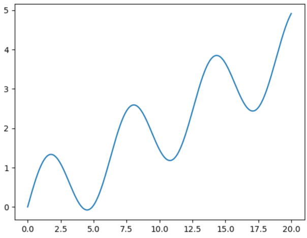
# Now decorating
plt.plot(x,y)
plt.xlabel('x = input')
plt.ylabel('y = output')
plt.title('Line Chart'); # semicolon supresses output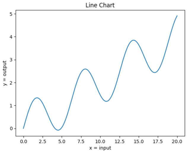
Scatterplot
# Creating random data
# 100 data points with dimensionality 2
# rand draws from the "standard normal" distribution, so by default these points are currently centered at 0
x = np.random.randn(100, 2)
# each row represents a 2D point:
# 1st value (column 0) is the x coord
# wnd value (column 1) is the y coord

# 1st arg - horizontal axis, 2nd arg - vertical axis
# x[:,0] is the 1st column of x, x[:,1] is the 2nd column
plt.scatter(x[:,0], x[:,1]) 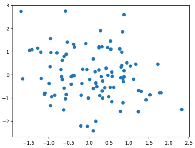
x = np.random.randn(200,2)
x[:50] += 3
"""
> x[:50] refers to the first 50 rows of x
> += 3 adds 3 to both columns of those 50 rows -> shifting the first 50 points by 3 units to the right and 3 units upward (because you're adding 3 to both the x and y values).
> After this operation, the first 50 points (the first half, in a sense) will be clustered around the point (3, 3) instead of (0, 0).

"""
y = np.zeros(200) # 1D array of length 200
y[:50] = 1 # setting the first 50 elements of y to 1
plt.scatter(x[:,0], x[:,1], c=y)
# c stand for color
# c should be a 1D list/array containing integers corresponding to how you want to color the data pointsx[:,0]selects all values from column 0, getting all the x coordsx[:,1]selects all values from column 1, getting all the y coords- c=y means that the color of each point is determined by the corresponding value in y.
y[0] = 1: This means the first point (x[0]) will get one color.y[50] = 0: This means the 51st point (x[50]) will get another color.- The first 50 points will be colored one way (because
y[:50] = 1). - The remaining 150 points will be colored differently (because
y[50:] = 0).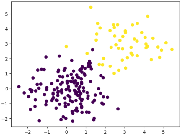
- The first 50 points (from
x[:50]) have been shifted to the area around (3, 3) and will be colored differently (because their correspondingyvalues are1). - The remaining 150 points (from
x[50:]) are still centered around (0, 0) and will be colored based on y=0.
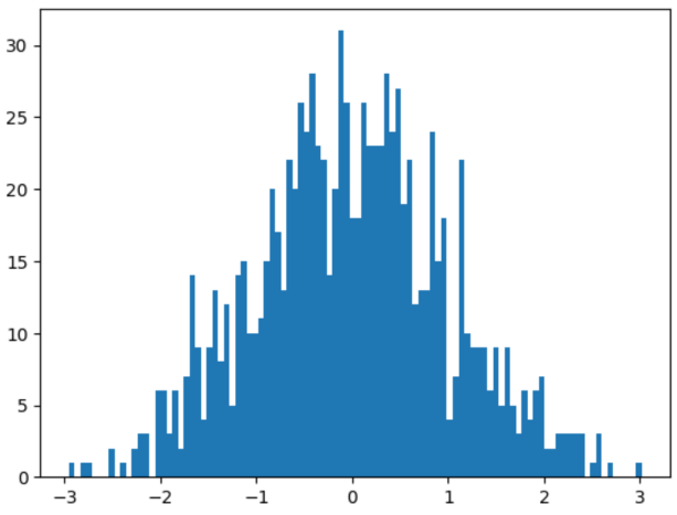
Histogram
- Lets us see the distribution of our data (probability distribution) → Lets us see what kind of distribution our data has
x = np.random.randn(1000)
plt.hist(x,binx=100); #bins is optional