- type of css framework
- contains premade CSS files, which you can just include in your projects (pre-built components and styling)
- 12 column layout system (built on top of flex box) that makes it really easy to create responsive websites that simply just work
- when to use
- if u want to create a mobile first, responsive application quickly
How to use
- CDN link (Content Delivery network)
- external css link into the head section of our html
- any functionality related to the end of the body section
Breakpoints
- https://getbootstrap.com/docs/5.0/layout/breakpoints/
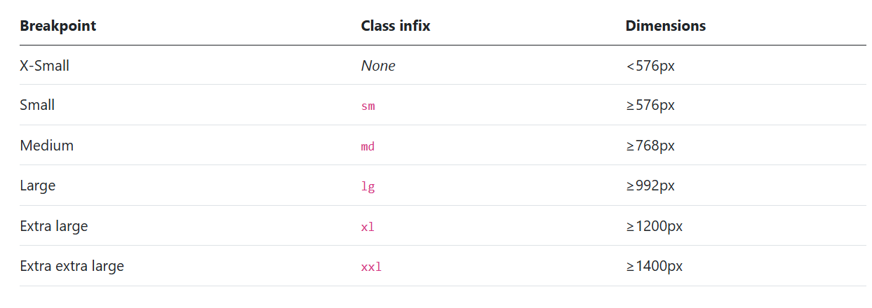
- if you have
col-sm-2in ur code, then ur code is defined for sm and above but undefined for below sm
- desktop breakpoint is
xl
- desktop breakpoint is
Layout
12 column layout system https://github.com/appbrewery/bootstrap-layout
- 3 components
- div class of container
- div class row (inside div container)
- items inside row div (made out of column system)
<div class="container">
	<div class="row">
		<div class="col">Hello</div> // as many of these col
	</div>
</div>- The columns auto-fit
- they are responsive, all columns will have equal width in the page
Sized columns
<div class="container">
	<div class="row">
		<div class="col-2">Hello</div>
		<div class="col-4">Hello</div>
		<div class="col-6">Hello</div>
	</div>
</div>- instead of just writing
col, writecol-2which means it will take 2 columns out of 2+4+6=12 - will never stack vertically
<div class="container">
	<div class="row">
		<div class="col-sm-2">Hello</div>
		<div class="col-sm-4">Hello</div>
		<div class="col-sm-6">Hello</div>
	</div>

	<div class="container">
		<div class="row">
			<div class="col-sm">Hello</div>
			<div class="col-sm">Hello</div>
			<div class="col-sm">Hello</div>
		</div>
	</div>
</div>- (w/ number)
col-sm-2- then on screens sm and larger the column will take 2 out of 12 columns
- (w/o number)
col-sm- they will just automatically distribute equally >= sm
- For both cases, below sm, the column will stack vertically, all cols becoming 100% width
Multiple breakpoints
col-sm-12 col-md-8 col-lg-4- lg or bigger → takes 4 cols
- md or bigger → takes 8 cols
- sm or bigger → takes 12 cols
<div class="col-lg-6 col-sm-12 col-10">Column 1</div>
<div class="col-lg-3 col-sm-6 col-10">Column 2</div>
<div class="col-lg-3 col-sm-6 col-10">Column 3</div>-
the last is
col-10, the smallest -
bootstrap now supports dark mode lol
<html lang="en" data-bs-theme="dark">